View sales by new time periods on the Analytics Dashboard
We’ve expanded the Sales by Hour chart to offer daily, weekly, monthly, and yearly analysis options!
At ShopKeep, we love getting your feedback. Your needs and business goals are a critical driver of our product development process and we’ve heard from many of you how important it is for you to see your sales by different time periods. As we know from our own experience, being able to quickly and easily measure your performance across weeks or months helps with understanding your current business and making smarter business decisions going forward.
Our latest enhancement is a direct result of your feedback. It upgrades the Sales By Hour chart on your Analytics Dashboard to so you can now group sales by days, day of week, weeks, months, and years. These different time periods are all easily accessible and adjustable via a handy dropdown menu at the top right of the chart.

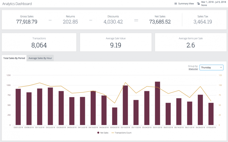
As with the Sales By Hour chart, the data is for the selected time period you’ve chosen on the Analytics Dashboard, not for any comparison dates. Each bar represents your Net Sales for a given time period and the line tracks the number of Transactions across the full time period of the selected chart. Additionally, the left axis gives you your scale for Net Sales, while the right axis gives you your scale for Transactions. To learn more, check out our Support article.
We’d love to know how you’re finding these changes, and what other changes you’d like to see with the Trends tile in your Analytics Dashboard. Share your thoughts in the comments below, or send an email to [email protected].

Want to try ShopKeep for yourself?
Just answer a few easy questions.
Need help finding the right point of sale?
Just complete the form. We’ll call you right back to explain how ShopKeep can work for you.
Hit the ground running.Sprinting, in fact!
Read our free, comprehensive guide, Small Business 101, to learn all you need to know about starting a thriving business.