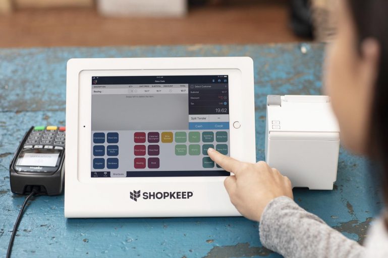
Exciting changes are here with ShopKeep Register 4.0

Enjoy BackOffice management features on the Register, improved navigation, and a fresh coat of digital paint!
This register release is a summer blockbuster you won’t want to miss. In response to extensive customer feedback asking to allow staff to manage items at the Register, we’ve gone ahead and built these features directly into the Register. We’ve also made a number of small experience improvements throughout the app.
This post will take you through the key changes in ShopKeep Register 4.0 for iOS so you can get as excited about everything as we are!
BackOffice on the Register
Register 4.0 brings over key BackOffice features to save you time and effort with inventory management and your register button layout (now called “Shortcuts”).
Over the years we’ve heard from many business owners that employees need to be able to add and update items and adjust the Register layout. Up until now, doing this at the front counter has been inconvenient. Typing login details into BackOffice using the iPad’s on-screen keyboard is tedious, and BackOffice can be clunky to use on an iPad, with some pages taking a long time to load on older models.
Now, when an employee with BackOffice permissions logs in to the Register with their 4 digit PIN code, they can add any inventory item directly from the Main Menu AND put it on the register wherever they need it for easy access. When they do, they’ll find these experiences have been optimized for iPad, with no BackOffice menu to distract from the task at hand, and faster loading to improve efficiency. That goes for new items or editing of shortcuts for your existing items, so you can make things as easy as possible for your cashiers.
The New Transaction Screen
In addition to bringing in BackOffice features, Register 4.0 makes some key adjustments to the layout of the Transaction screen.
The biggest change is that the search bar has moved from the top right of the screen to the bottom left and that it’s gone full-screen once you tap it, making it easier to find exactly what you’re looking for faster. If you use saved checks, take note that the Save button is now an icon in the upper right corner of the screen. Additionally, we’ve moved the Delete and Print options to the upper right and made them icons as well.
Lastly, we’ve made it even easier to start a transaction, by adding a prompt about how to add an item, including another link to search. And on the tender front, we’ve slightly adjusted how you finish a transaction, giving Split Tender its own button and putting the rest of your favorites from the “More…” menu under the “…”.

Main Menu Reorganization
On the management side, the Main Menu (formerly known in some circles as the Control Panel) has been reorganized into new sections and existing pages have been given more intuitive names, making it easier for both new and existing employees to navigate the Register (see here for the full rundown).
The top section focuses on Transactions, followed by Cash Management, Setup (which includes the aforementioned BackOffice features), and lastly Support, with the exact sections available depending on your employee’s level of access. We hope this makes it easier than ever to find and accomplish exactly what you need to do.

The “ShopKeep Blue” Period
Last, but not least, and probably the first thing you’ll notice when you open up the app is that we’ve gone from green to blue. All the main action buttons are now “ShopKeep Blue”, most prominently Cash and Credit on the Transaction screen, but you’ll also see them throughout the app. This change brings the iOS Register design in line with the BackOffice, Pocket, and our Android register to keep your experience familiar throughout.
Using Register 4.0 and Beyond
In order to allow you to manage all this change at once, all changes but the color adjustments are turned off for you when you initially update to 4.0. As soon as you’re ready to take the plunge and embrace the changes, simply visit your BackOffice here to turn them on.
Also, please note that you will not be able to see the item management functionality on the Register unless your Register User also has BackOffice Manager access. Check out our FAQ to learn more about this subtle, but important distinction.
Lastly, don’t wait too long to try out the changes, because they will become mandatory at some point in the coming months. And if you’re looking to add a new location, 4.0 offers much improved guidance in onboarding for new ShopKeep customers.
We can’t wait to hear your feedback on everything here so please email us at [email protected] or use the Send Feedback link in your BackOffice. For a detailed rundown of every change, visit our Support Site to learn more.
Update your ShopKeep Register Now
Update: As of November 1, 2019, all of the layout changes mentioned in this point will be mandatory for all customers using version 4.0 or later of the ShopKeep Register app for iOS.
Want to try ShopKeep for yourself?
Just answer a few easy questions.
Need help finding the right point of sale?
Just complete the form. We’ll call you right back to explain how ShopKeep can work for you.
Hit the ground running.Sprinting, in fact!
Read our free, comprehensive guide, Small Business 101, to learn all you need to know about starting a thriving business.


