10 Store Design Ideas That Save Money and Boost Sales
Studies show that 40-70% of consumers make their purchase decision at a physical retail location. It is, therefore, crucial that you take the time to design a clean, beautiful and efficient in-store environment.
There are, of course, a million ways to improve your store design, but we don’t all have the funds required to contemplate an expensive overhaul. That’s why we listed a few strategic ideas to help you spruce up your retail space – without blowing your budget.
Creative Decluttering
In general, in small business, less is more. When you’re living in a sales per square foot kind of world, this might sound counterintuitive. After all, your retail sales per square footage affect your store’s revenue. But the reality is that if you’re store design is messy or crowded, you’re going to drive customers away.
In web design, a lot of attention is paid to what is known as ‘white space.’ That’s the space around the text and images that you’re hoping to draw attention to. Too little white space and you’ll find that the reader’s eye can’t focus on the things that you want them to be focused on. Too much white space and you’ll find yourself missing an opportunity to communicate something unique and fun about your brand and your business.
Apply this design principle to your store’s window displays, at your point of sale, and throughout your retail location.
Defining Your Message According to Store Zone
Break your store out into zones. I’d suggest the following for a small retail store:
Outside Store – (standing outside store)
Front of Store – (first impression as you walk through the door)
Merchandise – (perusing merchandise)
Changing Rooms (if applicable)
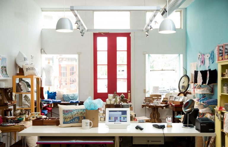
Point of Sale– (at the retail counter)
Misc. (Rest Rooms, etc.) Leaving the Store
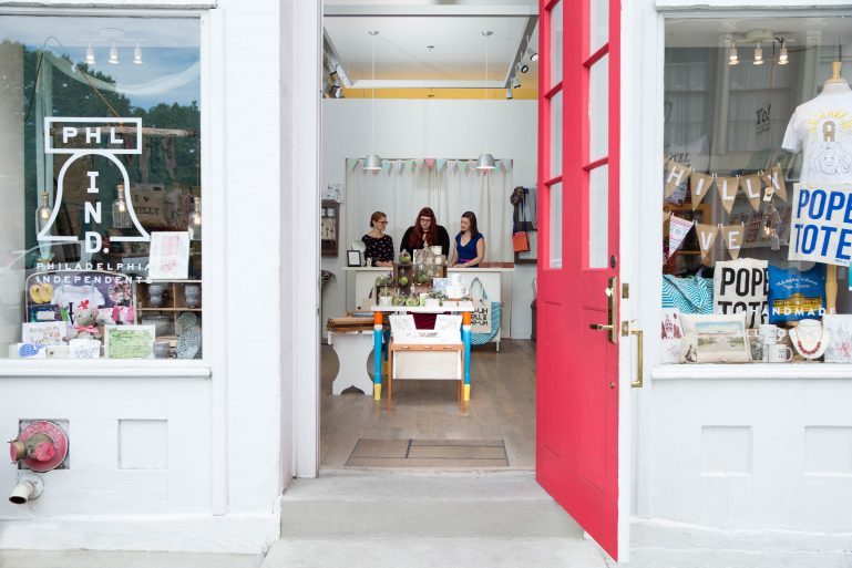
Once you have this list, walk through your store and assign one message/feeling that you’d like to communicate at each point of the ‘customer journey.’ What are you hoping to convey with your store windows? What about your retail counter design? Or the display behind your store counter? The messaging and merchandise should align with what the customer is most likely to be open to/interested in within that zone. It’s amazing how many small, illegible messages are communicated on people’s front windows – even though consumers are often passing at a distance. Equally, your store counter is prime up-sell space in your retail store. Leverage this as an opportunity to reinforce a concrete offer that can drive a higher ticket size (15% off sales of $50 or over) or encourage repeat business (15% of your next order with this coupon). You don’t have to spend more on signage or marketing collateral. You just have to be smarter about where it’s placed.
SEE ALSO: Delighting the Five Senses in Your Retail Store
Clean, Clean, and Clean Again
Remember all of those times your parents nagged you about cleaning up your room? As annoying as it was, they were preparing you for this moment. The day you would own your own retail store. Well, maybe not quite, but it should go without saying that cleanliness has an impact on your customers’ shopping experience.
In fact, one-half of shoppers have avoided a business because it looked dirty from the outside. This doesn’t just mean you need to get your front windows washed (although that should be at least a bi-weekly habit). It means the bits you don’t like doing. The bits nobody likes doing: the restrooms; that awkward bit in the refrigerator grate that you can never quite get to; Underneath the equipment – even the parts that no one ever sees. There are specialized services that can do this for you, but you can keep costs down by doing it yourself or enlisting some help from your relatives. After all, that’s what family is for.
Adjust Your Lighting Design
A quick and cheap way of improving the look of an older store is to replace all light bulbs. As bulbs age, they can give off a more yellow-brownish light rather than a crisp white-yellow light. Strip malls are absurdly brightly lit – consumers respond well to this kind of lighting because they can assess the quality and color of your wares more easily.
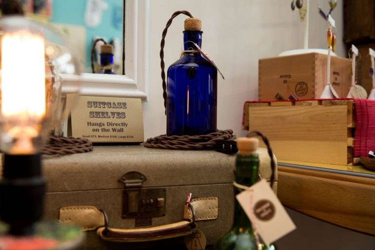
In general, lighting is overlooked by a lot of stores which is a shame. Edison lights, uplighting, spotlighting, track lighting can all be used to highlight certain elements and draw attention to promotions. It can also serve as an important way of setting the scene in your store. Your store is a great place to communicate your brand, so have fun with colored lights or bespoke fittings. If you’re worried about the expense of this kind of specialized lighting, make sure to check out a store/restaurant close-down auction near you.
If you’re seeking long-term savings, an often overlooked option to consider is LED lighting. LED lights use at least 75% less energy and last 25 times longer than traditional incandescent light bulbs.
Reduce, Reuse, Recycle
25% of all small businesses fail within their first year. The upside to this is that there are a lot of retail fixtures, general display paraphernalia and store paraphernalia circulating at any one time. Think creatively about how you could use those materials to suit your store design needs – even if they don’t seem like a perfect fit at first, it’s amazing what a bit of ingenuity can do!
Store Displays for Days
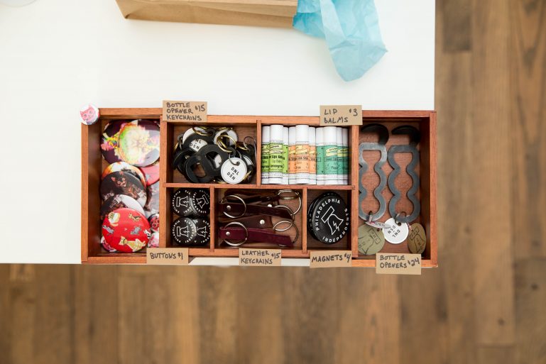
Endcaps aren’t everything when it comes to retail displays. Shake up the way you showcase your wares by using non-traditional shelving options. Things like oak rum barrels or clothes hanging on display around an old bicycle that you’ve painted bright yellow, or really anything your imagination can think of! A great way to approach displays is to play the word association game. When people think of your goods what words do you want them to think of? Funky? Elite? Comfy? Once you have this word you can brainstorm display ideas that will put that feeling into people’s minds.
If you happen to live by an IKEA, they also offer a variety of retail storage display solutions that can be customized and adapted for your business needs at a fraction of the price.
Creating a Purchase Path
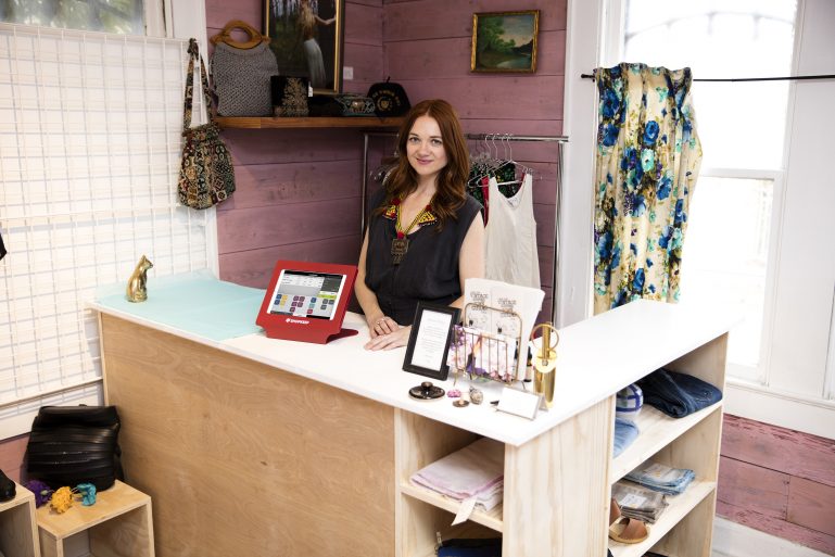
Mix things up with your flooring. Customers are known to gravitate towards areas of your store that are clearly demarcated with separate flooring. Retail stores go to great lengths to create an ‘island’ feeling around their point of sale environments. This makes the sales space an inviting one that people want to approach. This need not be insanely expensive. It could be as simple as a well-placed rug. The main goal is to design the store in a way that creates a purchase path. Do this by focusing on two main goals- (1) increased exposure to store inventory (2) increased flow of store traffic.
SEE ALSO: How to Keep Your Customer Retention Rate High
Create a Few Speed Bumps
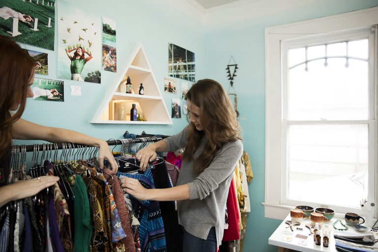
In retail, speed bumps are designed to do exactly what they do on the road- slow you down. Just past the entry is where you want to place fixtures intended to draw your customers’ attention, stop them in their tracks and get them engaged. Small tables and sales racks make great speed bumps throughout your store. Just make sure you are creating a theme with each rack and rotate the product on your speed bumps regularly to get regulars to make their way around your store.
Turn on the Senses
Music and ambient scenting may not be two things that naturally come to mind when you think retail design, but great design isn’t just about what your store looks like, it’s about how it makes your customers feel. Sound and smell have a clear impact on your customers’ decision-making process, and studies have shown that the perfect combination of product and sensory stimulus can encourage customers to buy more.
Bring in some speakers, download Spotify and observe what type of sounds get shoppers in the spending mood. The same idea applies to scents. Head down to the store and buy a few oil diffusers and place them strategically around the store.
Again, there’s a reason that big-box retailers constantly pump out upbeat, if not sometimes insane tunes in their stores. It puts consumers in a positive frame of mind. Obviously, we hope you’re a bit more discerning about your soundtrack of choice, but the sentiment remains the same!
Design a Power Wall
An effective power wall catches your customers’ attention the minute they walk into your store. This is where you want to display your feature inventory such as hot selling items or the latest fashions on the market.
Bottom Line
There are a lot of quick and simple steps you can take to improve your retail store design without a big box budget. In addition to the recommendations that we have highlighted above it is important to remember that the amount of time and money a customer is willing to spend in your store comes down to one simple fact, how comfortable they feel. Have an additional suggestion on how merchants can improve store design on a budget? We’d love to hear your suggestions in the comments below.
Want to try ShopKeep for yourself?
Just answer a few easy questions.
Need help finding the right point of sale?
Just complete the form. We’ll call you right back to explain how ShopKeep can work for you.
Hit the ground running.Sprinting, in fact!
Read our free, comprehensive guide, Small Business 101, to learn all you need to know about starting a thriving business.

